
Domus web design
Elevating user experience with clear and consistent component interaction guidelines

Overview
ABOUT DOMUS
The Caxias do Sul General Hospital serves as the sole oncologic center for a region comprising 48 cities. Domus provides accommodations for children from smaller towns receiving treatment, aiming to raise awareness of cancer symptoms and share information about their charitable projects through their website. The platform serves as a hub where users can look for updates, organizational insights, send volunteer applications, and donations.
THE PROJECT
I worked as a remote UI designer, under the supervision of a senior designer. I had a small timeline and communication with stakeholders was limited due to the coronavirus pandemic.
Communicating care
UNDERSTANDING THE BRANDING
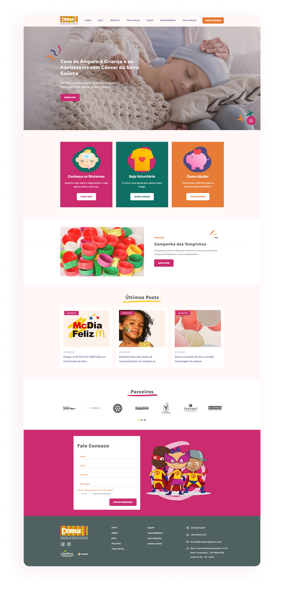
I started by looking at the organization’s social media to better understand how the brand was already communicating itself, since it didn’t have a manual or style guide. I selected some photos that encapsulated the story I wanted to tell. A story about a caring, hopeful, and safe space. Some themes emerged through the pictures: kids playing together, the warmth of sunlight, coloring, and face painting.

COLOR PALLETE
The only official branding elements we had were the organization’s colorful logo and some cartoon characters. These served as the foundation for a color palette. I opted for slightly muted versions of the logo’s colors. Instead of white, I chose a very light orange for backgrounds – the color of a sunlit room. Instead of black, I used a medium gray for lower contrast. The result is colorful and playful, yet calming and reassuring.


Organizing information
To structure my ideas and prioritize content, the next step involved wireframing and creating a simple sitemap. Multiple calls to action were essential to encourage users to donate, learn important information about diagnosis, support the organization’s projects, and volunteer.
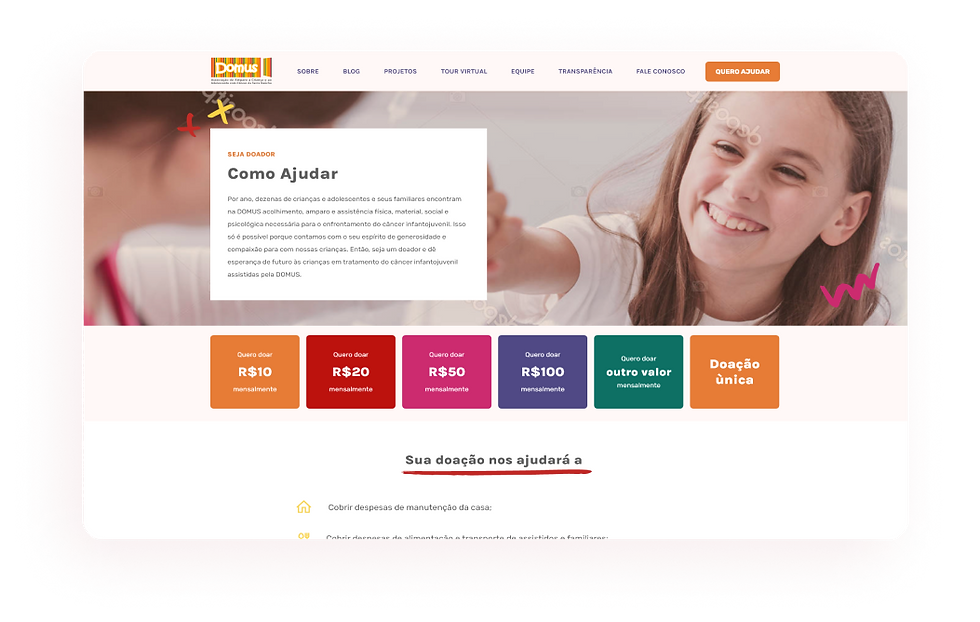
I designed a homepage that facilitates navigation, with colorful cards for the most important links. The donation link is placed in the fixed header as a contrasting button, ensuring higher visibility and easy access throughout the site.
Creating a cozy UI
The final product features carefully chosen photography from their database, avoiding stock images that might feel cold and commercial. Where stock photography was necessary, it was thoughtfully selected.
Following the organization’s culture of having kids paint, draw, and color for fun, I used small, colorful doodles to decorate and highlight specific points.

In line with the cartoon characters the brand already had, I selected an icon pack that matched this theme. The icons are used on the cards to help communicate their messages and grab users' attention. I incorporated subtle shadows and smooth animations on hover to encourage interaction.

The prototype


Impact
This is a project I hold close to my heart. Designing for a sensitive cause like cancer care reinforced the significance of empathy in crafting a meaningful user interface. This case highlights the importance of flexibility, empathy, and resourcefulness in overcoming challenges and delivering a successful final product. The new website brought some positive impact to Domus:
Increased donations throught donations plans
The new feature allows users to register in a monthly payment donation plan in a range of values in pagSeguro. The high visibility of the feature and simplicity of use the platform offers makes it easy for users to contribute to the cause. Other donation methods are also available and clearly communicated in the same page.
Growth in engagement with collection project
Domus bottle caps recicling project, where contribuitors donate caps in several points across the city, is a big source of earnings and helps provide with better care for the kids. With information about collection points and accepted types of caps, the website seems to have contribuited for a greater amount of collections in the year after the website was implemented.
Easy access to communication channels
The new website has a findable and simple contact form, accessible contact information and a fixed whatsapp button, the most used communication tool in Brazil. Allowing users to send questions and, if needed, ask for assistance.
Better visibility of important information
Domus goals and current actions are clear and easy to find, and are communicated with a sensible voice. It informs about early simptoms and and invites new users to simpatize with the cause.
.png)