
PontoWeb's Timecard Review
Simplifying workflow and enhancing efficiency for HR teams
.png)
Background
*One that is a longer than I'd like, but bear with me.
PontoWeb and brazillian labor hours
PontoWeb is the flagship product of Ahgora Sistemas, a pioneering Brazilian company specializing in cloud-based electronic time tracking and timesheet management software.
In Brazil, labor laws are highly regulated, requiring companies to meticulously track working hours to ensure employees are paid fairly and work within legal limits. Accurate time tracking is also essential for managing “Banco de Horas” (hour bank), a system where overtime hours are not paid immediately but instead saved as time-off credit. Additionally, it plays a critical role in managing overtime and ensuring compliance with labor regulations.
For employees, PontoWeb provides web and mobile interfaces that allow users to register time entries, submit adjustments, request PTO, and review and sign timesheets.
For HR teams, the platform offers robust tools to streamline timesheet-related processes with legal and fiscal security, significantly reducing the time spent on administrative tasks.
As with many products that grow faster than they can be maintained, PontoWeb is a legacy system. However, innovation remains at its core and continues to be a key differentiator in a competitive market.
The project
When employees submit requests PTO or corrections to their time entries, these requests are sent to an approval list. Typically, the employee’s direct lead or an HR representative is responsible for reviewing and approving them.
However, the existing review flow for these requests was far from ideal. My task was to find the flow's biggest problems and improve this process to make it more efficient and user-friendly.
Users were spending up to 1 hour weekly navigating outdated approval flows, leading to missed deadlines and increased error rates. The process was described as ‘frustrating’ and ‘prone to mistakes,’ directly impacting team productivity.
Problem Identification
Discovery Process and Research Methods
Internal Interviews
I began by conducting a series of interviews to gather insights from internal teams, including engineering, customer support, and implementation teams. This helped me map out the flow, technical constraints, and common complaints.
Desk research
To further understand the flow, I conducted extensive desk research using internal resources, including knowledge base review, watching screen recordings, analysing heatmaps, and examinig historical suppport tickets.
Usability Tests
I conducted usability tests on the flow as is to identify usability issues and common pain points. These tests provided valuable insights into how users interacted with the platform and highlighted areas for improvement.
So here's what I found
Main Problems and User Pain Points

Eduarda Lima
HR Coordinator
As an HR Coordinator, you’re responsible for a wide range of tasks, including approving time entry adjustments for a team of 30 people.

imagine this is you
Your schedule is always packed
...and approvals are time consuming
So you timeblock 30mins a week for managing approvals.

And when the time comes
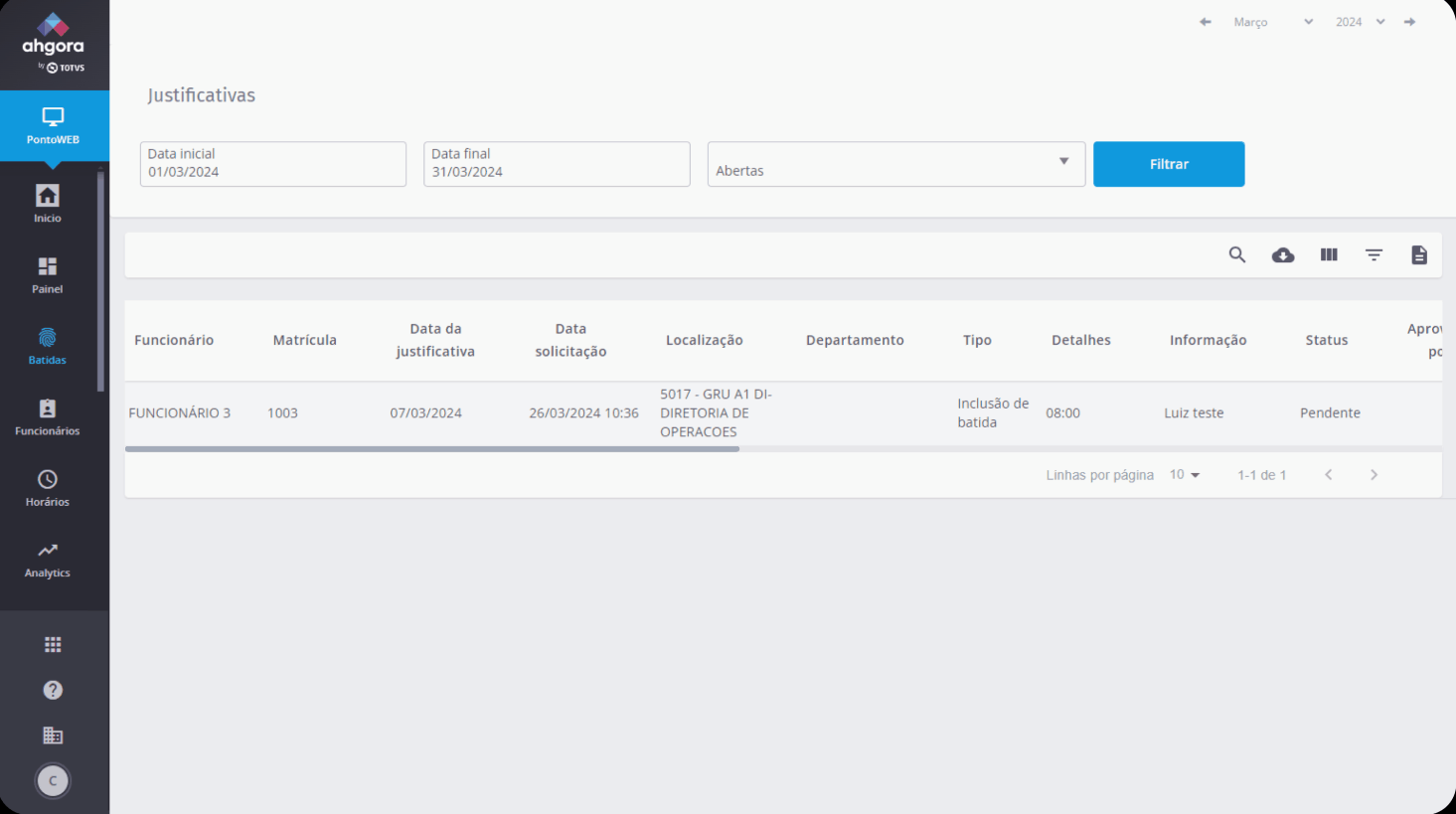
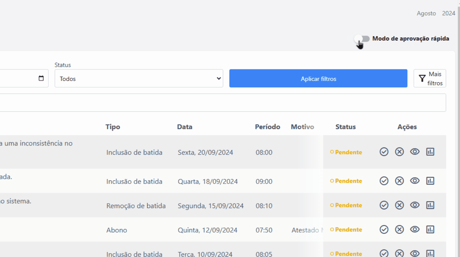
you open this page:

And then, for each request, you:
1. Review it
Trying to understand what the request is about by reading this table with confusing headings and not enough information.
If you have a small screen:
2. Search for buttons
That are hidden on the table's horizontal scroll.
3. Click the right button
✅ To approve
❎ To deny
👍 A̶l̶s̶o̶ ̶a̶p̶r̶o̶v̶e̶?̶ To unlock secret steps*

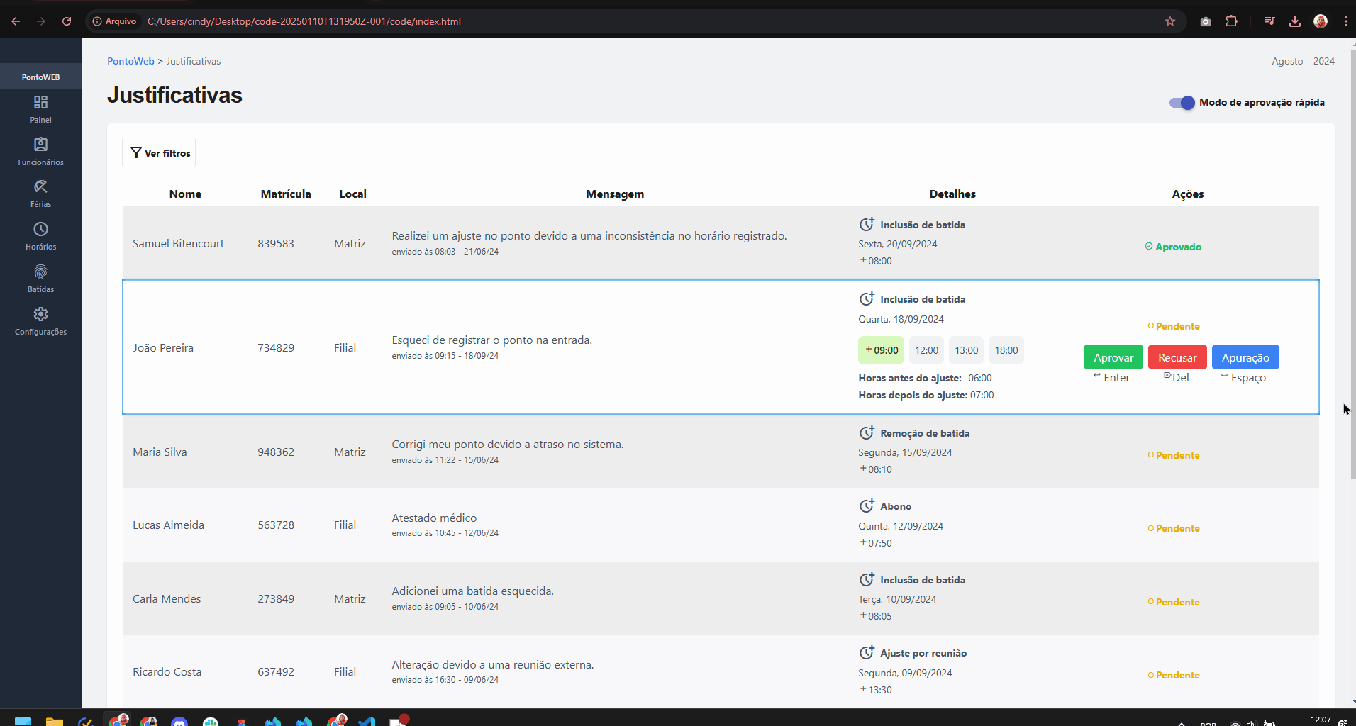
*The secret steps
You have to click the secret steps button if you need to:
a. Understand how the request will impact the employee’s timesheet
b. See how frequently the employee is making adjustments
c. Access attached files (important for doctor notes)
d. Check the remainder of the employee’s time entries for the day

The button takes you to the employess time card, where you will:
-
Review the request contextualized in the timecard
-
Click the yellow tiny button.
-
See more information about the request (including attachments) in a pop-up.
-
Approve or deny the request in the pop-up.
-
Wait for the page to reload.
-
See how the request impacted the thimesheet.
and then, finally:
7. Go back to previous page
because you have around 50 more requests to review

it’s hard to trust what you can’t see
"[...] before approving anything I would open their [the employee’s] timesheet to make sure all entries are correct"
but going out of flow created a slow & frustrating review experience
reviews took up to 5
59,2s
by submission
review sessions were
43%
longer that other sessions
This issue ranked among the
TOP 5
support ticket categories
The other (older) flow
Because that was the most recent flow, but not the only one.
The previous version of this flow remained live for years even after the new one was developed. While there’s no documented reason for this decision, the general consensus is that users were resistant to the redesign, with many explicitly requesting to continue using the older version.
Both flows were equally problematic and inneficient in different ways.

Low-fi prototype
Coded by me!
Adressing issues. Nothing else.
This version solves existing problems, updates the UI, but keeps user’s in their confort zone.
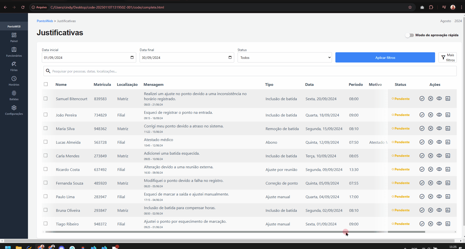
Fixed collumns and access to files
Action and status collumns are always visible. Including when there is horizontal scroll.
Files are accessible directly on the table.
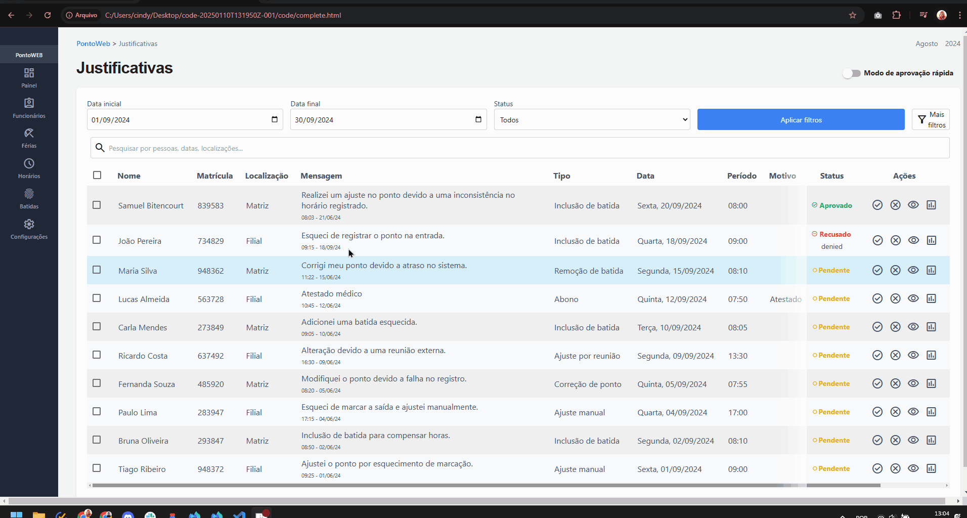
Better feedback for actions
Status changes are now more visible, and denials include an input field for users to provide a reason. Enhancing communication and introducing intentional friction that helps reduce wrongful denials.
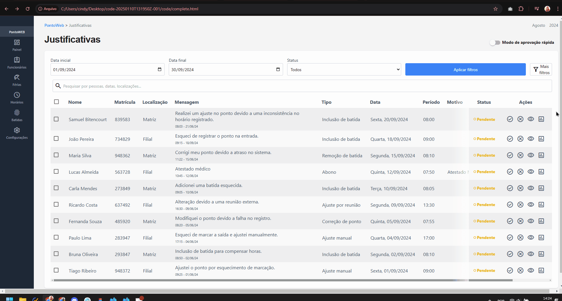
Multiapproval
Pending submittions can be mass approved.
But PontoWeb is about innovation
Even considering the partially change resistant userbase.
So I created a mode swap between 2 options.
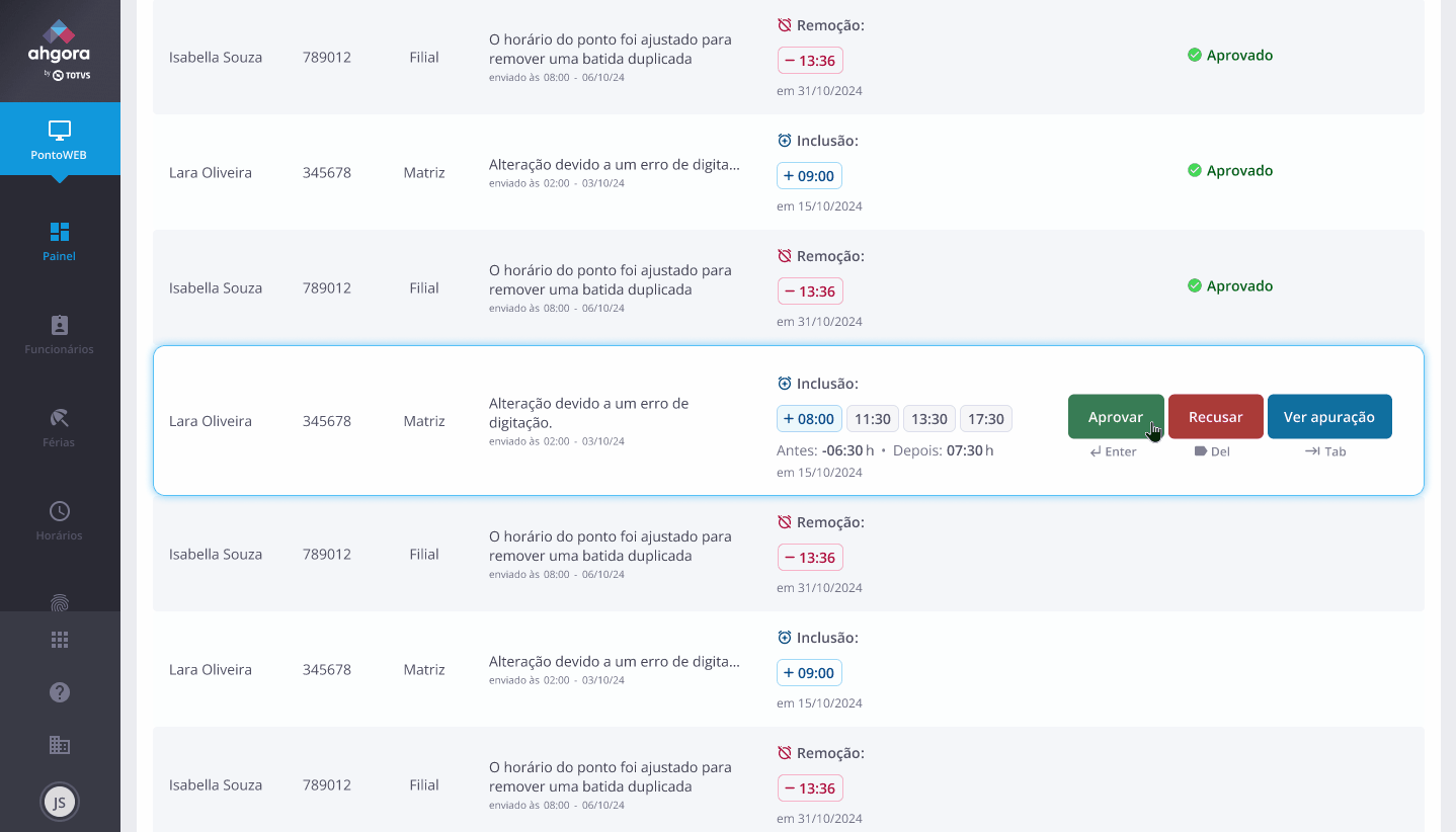
The efficient mode
The second, more inspired mode, aims to offer a even more efficient experience, and elevate user satisfaction.

Easy access to relevant info
Shows for selected submittions:
-
All time entries for the day
-
Hours totals before and after approval
Keyboard shortcuts
Navigation, approvals, denials, opening and closing attachments, all can be done by using keyboard shortcuts. Allowing a quicker approval proccess.
Interact with prototype
*By clicking this button you agree with being forgiving about eventual bugs and hiccups.
User testing results were positive
Well, mostly.
.png)
Scores are slightly higher
on tasks direcly related to approving submittions
Multi-approval is divisive
*The sample is small, but explanations are very relevant

3 users don’t like it
as it encourages overlooking a decision that impacts a legally important document.
2 users disagree
and feel like without it, the flow is still inefficient.
1 user was unsure
as they saw both pros and cons on the feature.
No mode-swapping
No users clicked the toggle to swap mode before being asked to do so. Possibly due to low visibility of the toggle, and general unawareness of the option.
Hesitancy about shortcuts
They noticed it, and even talked positively about it, but no users actively used shortcuts on the tests. Indicating that the feature may require some getting used to.
Final version
Refining the low-fi version by integrating user feedback & design system patterns

Onboarding
In the first access to the new flow, an onboarding pop-up introduces the new feature and prepare users for change.
Better readability
More information on selection and color coded request types.

.png)
Mode switching tip
Addition of a tooltip that guides the user back to the conventional format.
More visible feedback
and animations to support it.
Auto-scroll
Automatic scroll that places the next request's action buttons exactly were the previous were, reducing cursor travel.
Attachment view
Visualization of attachments inside the page, with the option to answer the request directly from the pop-up, including the keyboard shortcuts option.


Table version
Kept for easy visualization of all requests, and for change resistant users. But in easier to read format that follows the product's design system, with clearer action buttons and access to all important information.
Faster approvals, less confusion
"It’s way faster now, and I don’t get lost in the table anymore. This can make my day a lot easier."
tests showed the efficient mode had the potential to
reduce review time to
38.8s
by submission
make review sessions
35%
faster
decrease expected task difficulty by
20%
with more information available
Pushing the entire product forward
"...[the efficient mode] can be a first move toward modernizing PontoWeb. It could set the tone for a more user-focused product. Now we just need to see if it sticks with users."
— Project manager
Conclusion and Next Steps
This isn’t the end, it’s a starting point.
Clear Wins, Strong Foundations
The redesign simplified the timecard review process, making it faster and easier for users to manage request with fewer errors. By streamlining interactions and clarifying actions, the new flow supports daily operations while maintaining compliance with labor regulations. It also sets a solid foundation for future improvements.
Testing the Efficient Mode
The new efficient mode was introduced as an optional, faster workflow aimed at reducing repetitive actions. Stakeholders were excited about its innovative approach and its potential to make PontoWeb feel less like a legacy product. However, its future depends on user adoption and it's relation to mainetance dificulty.
Evolving With Users
Continuous feedback and real-world data will guide future tweaks, ensuring the system stays aligned with user needs. By treating this project as part of a larger shift away from legacy patterns, there’s room to explore more modern, efficient solutions that improve both the user experience and the product’s long-term value.
